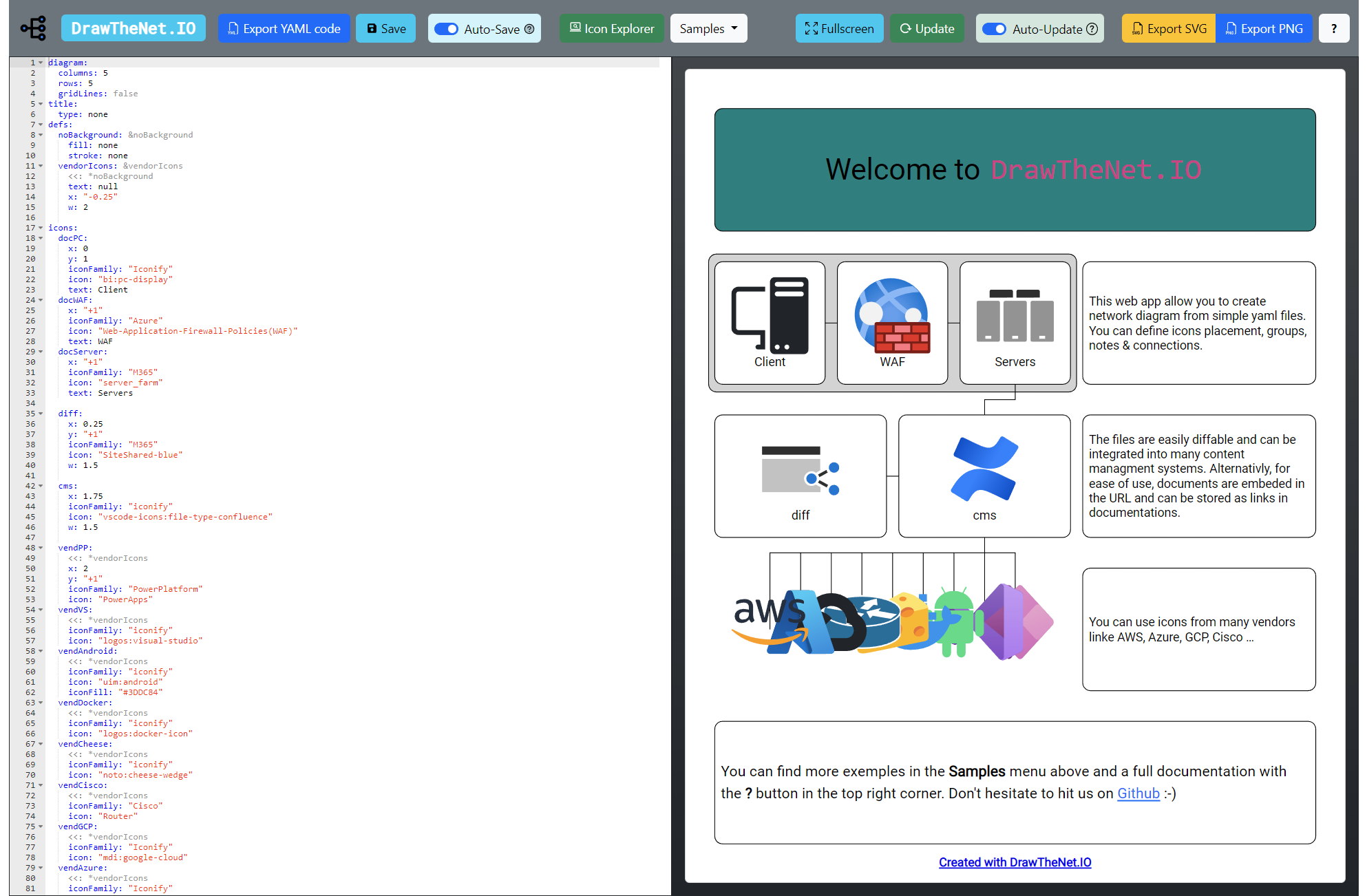
About
DrawTheNet.IO is a web application to draw network diagrams with simple yaml code.
Key Features
- Text-to-Diagram: Define your infrastructure using simple, human-readable YAML syntax.
- Extensive Icon Library: Built-in support for major cloud providers (AWS, Azure, GCP) and network vendors (Cisco, Fortinet), plus thousands of icons via Iconify.
- Version Control Friendly: Since diagrams are code, they can be stored in Git, diffed, and reviewed just like software.
- Export Options: Export your diagrams to high-quality SVG or PNG formats for presentations and documentation.
- Privacy Focused: The application runs entirely in your browser. Your diagram data is never sent to the server.
Documentation structure
You can navigate in the documentation using the tabs in the top.- About: This section
- Interface: How to use the interface
- General: General information about the diagram document structure
- Document: How to configure the document-level settings
- Diagram: How to configure the global diagram settings
- Title: How to configure the title infos & logo
- Icons: How to configure an icon/node
- Groups: How to group icons
- Notes: How to add notes to the diagram
- Connections: How to add connections between icons/notes
- Reference: Reference of all available options and parameters
Why this app?
I needed a simple way to draw network diagrams for my documentation.
I found some existing tools on the web, but I didn't like how they stored the diagrams.
I wanted something simpler and more "code-like". You can easily store your diagram source in a
Git repository or any documentation system. You can even use the generated URL to open the
editor quickly.
Feedback & Contributions
Found a bug? Have a feature request? The project is open-source!
Please report issues or contribute on GitHub.
More info on
Interface
The interface is divided into 4 parts:
- Top Menu (Top): Buttons to access settings, document library, samples, contact sheets, etc.
- Sidebar (Left Side): Control buttons and icon explorer.
- Editor (Middle): Where you can write your YAML code.
- Render (Right Side): The resulting diagram rendered from the code definition.
Top Menu Bar
The menu bar at the top provides access to the main application functions:
Editor Sidebar Controls
The left sidebar contains editor-specific controls and tools:
Editor
This is where you input your diagram code. Refer to the next section for more details on the document structure.The editor provides syntax checking for standard YAML documents but not for diagram-specific syntax.
You can refer to the YAML 1.2 specification for language details.
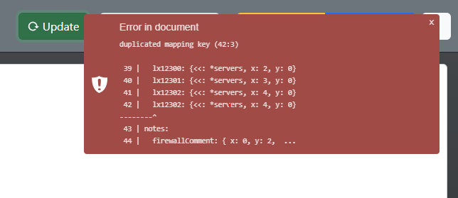
If a syntax error is found by the editor, it will be shown next to the line number:
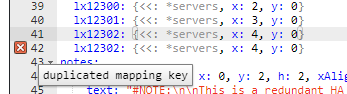
You can get details of the error by hovering the mouse over the error mark.
Render
You can pan the diagram by clicking and dragging with the mouse.
You can also use the mouse wheel to zoom in and out.
If your render fails due to an error in your document code, you will see an error notification in the top right corner.
Icon Explorer
In the left sidebar, you have access to the icon explorer.Use the search input in the center to find the icon you need.
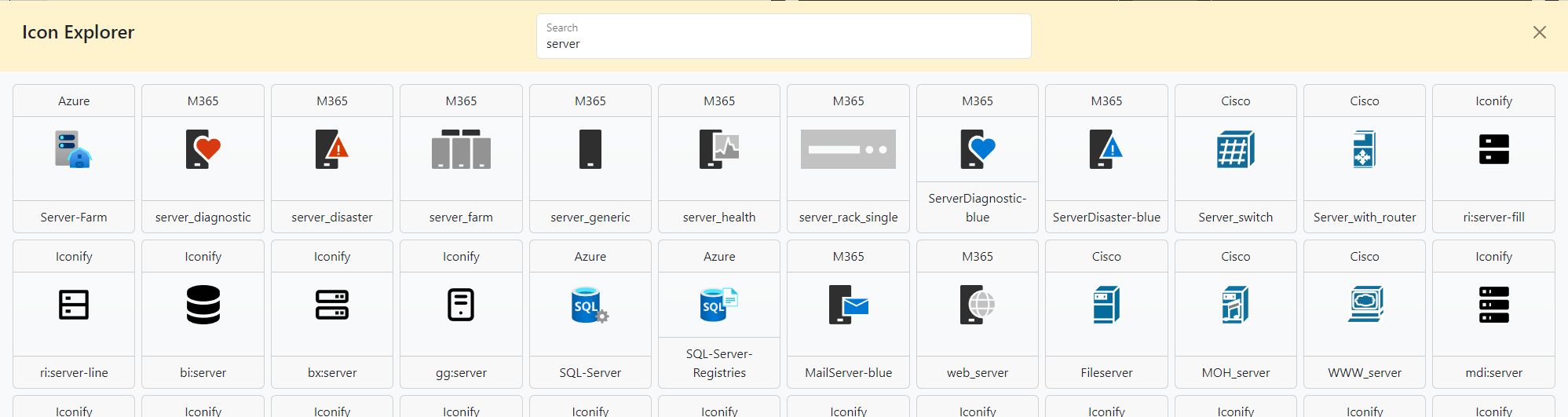
Each icon is represented by a tile.
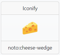
The top part displays the icon family name.
The middle part displays a preview of the icon itself.
The bottom part displays the icon name.
You can click on each of these 3 parts. The top and bottom parts will respectively copy the icon family name and the icon name to your clipboard, while clicking on the icon in the middle will copy the icon name along with the icon family name, ready to be pasted into your document.
General
The document is divided into multiple main sections.
- diagram: Defines the diagram's main properties.
- title: Defines the information & properties of the title section.
- icons: Defines the nodes of the diagram.
- groups: Defines groupings of nodes.
- notes: Defines markdown notes in the diagram.
- connections: Defines the links between nodes, groups, or notes in the diagram.
All these sections are optional; default values will be applied to most parameters. You can check the
details in the Reference tab.
Apart from these reserved names, you are free to define any other section name.
For example, you can define a section named
refs to store template objects:refs:
icon: &icon
iconFamily: Cisco
color: #ff0000
The keys of items in each section must be unique. For example, you can't define 2 nodes with the same name:
icons:
  myicon: { icon: router, iconFamily: Cisco, color: #ff0000 }
  myicon: { icon: AP, iconFamily: Cisco, color: #ffff00 }
icons:
  myicon: { icon: router, iconFamily: Cisco, color: #ff0000 }
  myOthericon: { icon: AP, iconFamily: Cisco, color: #ffff00 }
Defining Nodes & Placement
The core of your diagram consists of Icons and Notes. These are defined in their respective sections (icons and notes).
The Grid System
DrawTheNet.IO uses a grid system to position elements. The size of this grid is defined in the diagram section using columns and rows.
- x: Horizontal position. Starts at 0 (left edge) and goes up to columns - 1 (right edge).
- y: Vertical position. Starts at 0 (top edge) and goes up to rows - 1 (bottom edge).
By default, the center of the icon or note is placed at the specified coordinate.
Decimal Positioning
You are not restricted to integer values! You can use decimal numbers to place elements precisely where you want them.
For example, if you have a grid with 5 columns:
x: 0places the element at the center of the first column.x: 2.5places the element exactly between the 3rd (index 2) and 4th (index 3) column.
Alternate Coordinate Input
In addition to absolute coordinates, you can use relative positioning strings for x and y values.
-
Relative to Previous Node: Use a string with a signed number (e.g.,
"+1","-0.5"). This calculates the position relative to the node defined immediately before the current one in the YAML file. -
Reference Another Node: Use the format
"@nodename"to use the coordinate value of another specific node. -
Reference with Offset: Combine a reference and an offset using
"@nodename:+offset". For example,"@server1:+2"means "take server1's position and add 2".
Example: Relative Positioning
icons:
  NodeA:
    x: 0
    y: 0
    icon: router
  NodeB:
    x: "+2"       # 2 units right of NodeA (previous node)
    y: 0
    icon: switch
  NodeC:
    x: "@NodeA"   # Same x as NodeA
    y: "+2"       # 2 units below NodeB (previous node)
    icon: server
  NodeD:
    x: "@NodeB:+1" # NodeB's x + 1
    y: "@NodeC"    # Same y as NodeC
    icon: firewall
document:
  watermark: false
title:
  position: none
diagram:
  columns: 4
  rows: 3
  gridLines: true

icons:
  NodeA:
    x: 0
    y: 0
    icon: router
    iconFamily: cisco
    textLocation: bottomCenter
  NodeB:
    x: "+2"       # 2 units right of NodeA (previous node)
    y: 0
    icon: "Multiswitch_device"
    iconFamily: "cisco"
    textLocation: bottomCenter
  NodeC:
    x: "@NodeA"   # Same x as NodeA
    y: "+2"       # 2 units below NodeB (previous node)
    icon: "Server-Farm"
    iconFamily: Azure
    textLocation: bottomCenter

  NodeD:
    x: "@NodeB:+1" # NodeB's x + 1
    y: "@NodeC"    # Same y as NodeC
    icon: "Firewall"
    iconFamily: "Fortinet"
    textLocation: bottomCenter
Document
The document section is used to define document-level settings that affect the overall appearance
and behavior of your diagram.
Aspect Ratio
By default, the grid adapts to its container size.
If needed, you can define the aspect ratio of the diagram with the aspectRatio
property.
The aspect ratio is defined as a string in the format: "width:height".
For example, if you want a square diagram, you can set the aspect ratio to "1:1".
If you want to define a portrait diagram, you can set the aspect ratio to "1:2", for
example.
The default value is "auto", which adapts to the container size.
Example:
AutoFit Aspect Ratio (Default)
document:
  aspectRatio: "auto"
document:
  aspectRatio: "auto"
  watermark: false
title:
  position: none
diagram:
  columns: 5
  rows: 5
  gridLines: true
icons:
  MyRouter: {x: 2, y: 2, iconFamily: cisco, icon: router}
1:2 Aspect Ratio
document:
  aspectRatio: "1:2"
document:
  aspectRatio: "1:2"
  watermark: false
title:
  position: none
diagram:
  columns: 5
  rows: 5
  gridLines: true
icons:
  MyRouter: {x: 2, y: 2, iconFamily: cisco, icon: router}
Margin
The document margin defines the space around the entire diagram (including the title area if present).Margins are specified in pixels and can be configured for each side independently.
Defaults to 5px on each side.
Example:
Standard Margin (Default)
document:
  margin:
    top: 5
    right: 5
    bottom: 5
    left: 5
document:
  margin:
    top: 5
    right: 5
    bottom: 5
    left: 5
  watermark: false
title:
  position: none
diagram:
  columns: 5
  rows: 5
  gridLines: true
icons:
  MyRouter: {x: 2, y: 2, iconFamily: cisco, icon: router}
Heavy Margin (50px)
document:
  margin:
    top: 50
    right: 50
    bottom: 50
    left: 50
document:
  margin:
    top: 50
    right: 50
    bottom: 50
    left: 50
  watermark: false
title:
  position: none
diagram:
  columns: 5
  rows: 5
  gridLines: true
icons:
  MyRouter: {x: 2, y: 2, iconFamily: cisco, icon: router}
Background Fill
Customize the background color of the entire document using thefill property.This can be any valid SVG color (color name, hex code, or RGB).
The default value is
"white".
Example:
White Background (Default)
document:
  fill: "white"
document:
  fill: "white"
  watermark: false
title:
  position: none
diagram:
  columns: 5
  rows: 5
  gridLines: true
icons:
  MyRouter: {x: 2, y: 2, iconFamily: cisco, icon: router}
Light Gray Background
document:
  fill: "#f0f0f0"
document:
  fill: "#f0f0f0"
  watermark: false
title:
  position: none
diagram:
  columns: 5
  rows: 5
  gridLines: true
icons:
  MyRouter: {x: 2, y: 2, iconFamily: cisco, icon: router}
Watermark
Control the visibility of the "Made with DrawTheNet.IO" watermark using thewatermark
property.Set to
true (default) to show the watermark, or false to hide it.💗 Please consider keeping the watermark enabled to help promote the project! 💗
Example:
Watermark Shown (Default)
document:
  watermark: true
document:
  watermark: true
title:
  position: none
diagram:
  columns: 5
  rows: 5
  gridLines: true
icons:
  MyRouter: {x: 2, y: 2, iconFamily: cisco, icon: router}
Watermark Hidden
document:
  watermark: false
document:
  watermark: false
title:
  position: none
diagram:
  columns: 5
  rows: 5
  gridLines: true
icons:
  MyRouter: {x: 2, y: 2, iconFamily: cisco, icon: router}
Render Ratio
The render ratio defines the upscaling ratio for PNG exports.Higher values produce larger, higher-resolution images but also larger files.
Higher values will also increase the rendering time. Values above 25 might not render at all.
The default value is
3.
File Title Prefix
The file title prefix is added to exported filenames (code, SVG, PNG, etc.).This helps organize your exported diagrams with a consistent naming convention.
The default value is
"drawthenet.io".
Schema Version
TheschemasVersion property is reserved for future use and maintains compatibility
with different versions of the diagram format.The default value is
1.
Diagram
The diagram section is used to define the diagram's main properties.
Grid
You define the grid density using the rows and columns properties. These
define how many of each are available as coordinates for your nodes. The nodes will be centered on
the grid coordinates.
Note that modifying the number of columns/rows won't change the size of the diagram, as it will by
default adapt to the available space; it will only change the number of available coordinates.
There are no default values; both properties must be defined.
Example:
10x10 grid (Default)
diagram:
  columns: 10
  rows: 10
document:
  watermark: false
title:
  position: none
diagram:
  columns: 10
  rows: 10
  gridLines: true
icons:
  MyRouter: {x: 2, y: 2, iconFamily: cisco, icon: router}
5x10 grid
diagram:
  columns: 5
  rows: 10
document:
  watermark: false
title:
  position: none
diagram:
  columns: 5
  rows: 10
  gridLines: true
icons:
  MyRouter: {x: 2, y: 2, iconFamily: cisco, icon: router}
Grid Lines
To help you position nodes, you can show grid lines on the diagram.You can toggle grid line visibility by setting the
gridLines property.By default, the grid lines are hidden.
Example:
Grid lines hidden (Default)
diagram:
  gridLines: false
document:
  watermark: false
title:
  position: none
diagram:
  columns: 5
  rows: 5
  gridLines: false
icons:
  MyRouter: {x: 2, y: 2, iconFamily: cisco, icon: router}
Grid lines shown
diagram:
  gridLines: true
document:
  watermark: false
title:
  position: none
diagram:
  columns: 5
  rows: 5
  gridLines: true
icons:
  MyRouter: {x: 2, y: 2, iconFamily: cisco, icon: router}
Invert Y Axis
The grid origin is defined at the top-left corner of the diagram by default.You can invert the Y-axis so that the origin is at the bottom-left corner by setting the
invertYAxis property to true.
Example:
Standard Y Axis (Default)
diagram:
  invertY: false
icons:
  MyRouter: {x: 2, y: 1, iconFamily: cisco, icon: router}
document:
  watermark: false
title:
  position: none
diagram:
  columns: 5
  rows: 5
  invertY: false
  gridLines: true
icons:
  MyRouter: {x: 2, y: 1, iconFamily: cisco, icon: router}
Inverted Y Axis
diagram:
  invertY: true
icons:
  MyRouter: {x: 2, y: 1, iconFamily: cisco, icon: router}
document:
  watermark: false
title:
  position: none
diagram:
  columns: 5
  rows: 5
  invertY: true
  gridLines: true
icons:
  MyRouter: {x: 2, y: 1, iconFamily: cisco, icon: router}
Margin
The diagram margin, applied to the diagram only, defines the node render area excluding the title area (if present).Defaults to 10px on each side.
Example:
Standard Margin (Default)
diagram:
  margin:
    top: 10
    right: 10
    bottom: 10
    left: 10
document:
  watermark: false
title:
  position: none
diagram:
  columns: 5
  rows: 5
  gridLines: true
  margin:
    top: 10
    right: 10
    bottom: 10
    left: 10
icons:
  MyRouter: {x: 2, y: 1, iconFamily: cisco, icon: router}
Heavy Margin (100px)
diagram:
  margin:
    top: 100
    right: 100
    bottom: 100
    left: 100
document:
  watermark: false
title:
  position: none
diagram:
  columns: 5
  rows: 5
  gridLines: true
  margin:
    top: 100
    right: 100
    bottom: 100
    left: 100
icons:
  MyRouter: {x: 2, y: 1, iconFamily: cisco, icon: router}
Title
The title is an optional zone placed below (or above) your diagram node render area. It conveys general information about the diagram, its
production date, the author, and more.

Position
The title can be positioned at the bottom or top of the diagram, or hidden entirely.Use the
position property to control its placement.The default value is
"bottom".
Example:
Bottom Position (Default)
title:
  position: bottom
document:
  watermark: false
title:
  position: bottom
  text: "Bottom Position Title"
  author: "John Doe"
  heightPercentage: 20
diagram:
  columns: 5
  rows: 5
icons:
  MyRouter: {x: 2, y: 2, iconFamily: cisco, icon: router}
Top Position
title:
  position: top
document:
  watermark: false
title:
  position: top
  text: "Top Position Title"
  author: "John Doe"
  heightPercentage: 20
diagram:
  columns: 5
  rows: 5
icons:
  MyRouter: {x: 2, y: 2, iconFamily: cisco, icon: router}
Border Style
You can show the title with either a bar separator or a full box around it.Use the
border property to control the border style.The default value is
"bar".
Example:
Bar Border (Default)
title:
  border: bar
document:
  watermark: false
title:
  position: bottom
  border: bar
  text: "Bar Title Separator"
  author: "John Doe"
  heightPercentage: 20
diagram:
  columns: 5
  rows: 5
icons:
  MyRouter: {x: 2, y: 2, iconFamily: cisco, icon: router}
Box Border
title:
  border: box
document:
  watermark: false
title:
  position: bottom
  border: box
  text: "Box Title Separator"
  author: "John Doe"
  heightPercentage: 20
diagram:
  columns: 5
  rows: 5
icons:
  MyRouter: {x: 2, y: 2, iconFamily: cisco, icon: router}
Title & Sub-title Text
The title and sub-title are the main texts of the title area.Set them with the
text and subText properties, respectively.Default values:
text is "Diagram title", subText is null (not shown).
Example:
Title Only
title:
  text: "Production Network"
document:
  watermark: false
title:
  position: bottom
  text: "Production Network"
  author: "John Doe"
  heightPercentage: 20
diagram:
  columns: 5
  rows: 5
icons:
  MyRouter: {x: 2, y: 2, iconFamily: cisco, icon: router}
Title with Sub-title
title:
  text: "Production Network"
  subText: "Main Data Center"
document:
  watermark: false
title:
  position: bottom
  text: "Production Network"
  subText: "Main Data Center"
  author: "John Doe"
  heightPercentage: 20
diagram:
  columns: 5
  rows: 5
icons:
  MyRouter: {x: 2, y: 2, iconFamily: cisco, icon: router}
Author & Company
On the right side of the title, you can display the author and company information.Set them with the
author and company properties.If the value is
null, the entry will not be shown.Default values:
author is "Unknown", company is null (not shown).
Example:
Author Only
title:
  author: "John Doe"
document:
  watermark: false
title:
  position: bottom
  text: "Network Diagram"
  author: "John Doe"
  heightPercentage: 20
diagram:
  columns: 5
  rows: 5
icons:
  MyRouter: {x: 2, y: 2, iconFamily: cisco, icon: router}
Company
title:
  company: "ACME Corp"
document:
  watermark: false
title:
  position: bottom
  text: "Network Diagram"
  company: "ACME Corp"
  heightPercentage: 20
diagram:
  columns: 5
  rows: 5
icons:
  MyRouter: {x: 2, y: 2, iconFamily: cisco, icon: router}
Date & Version
Display the date and version information on the right side of the title.Set them with the
date and version properties.Default values:
date is the current date (YYYY-MM-DD), version is "1".
Example:
Default Date & Version
title:
document:
  watermark: false
title:
  position: bottom
  text: "Network Diagram"
  author: "John Doe"
  heightPercentage: 20
diagram:
  columns: 5
  rows: 5
icons:
  MyRouter: {x: 2, y: 2, iconFamily: cisco, icon: router}
Custom Date & Version
title:
  date: "2025/01/02"
  version: "2.0"
document:
  watermark: false
title:
  position: bottom
  text: "Network Diagram"
  author: "John Doe"
  date: "2025/01/02"
  version: "2.0"
  heightPercentage: 20
diagram:
  columns: 5
  rows: 5
icons:
  MyRouter: {x: 2, y: 2, iconFamily: cisco, icon: router}
Logo URL
On the leftmost part, you can find the title logo. It defaults to the DrawTheNet.IO logo, but you can change it by setting thelogoUrl property.It can be a URI or a base64 encoded image data URI.
Note that only SVG logos can be transparent.
Example:
Default Logo
title:
  text: "Network Diagram"
  author: "John Doe"
document:
  watermark: false
title:
  position: bottom
  text: "Network Diagram"
  author: "John Doe"
diagram:
  columns: 5
  rows: 5
icons:
  MyRouter: {x: 2, y: 2, iconFamily: cisco, icon: router}
Custom Logo URL
title:
  text: "Network Diagram"
  author: "John Doe"
  logoUrl: "https://example.com/logo.svg"
document:
  watermark: false
title:
  position: bottom
  text: "Network Diagram"
  author: "John Doe"
  logoUrl: "https://example.com/logo.svg"
diagram:
  columns: 5
  rows: 5
icons:
  MyRouter: {x: 2, y: 2, iconFamily: cisco, icon: router}
Logo Icon
Instead of using a logo URL, you can use an icon from the available icon families.Set the
logoIcon property to use an icon, and logoIconFamily to specify which icon family.If
logoIcon is specified, it takes precedence over logoUrl.Default values:
logoIcon is null, logoIconFamily is "Iconify".
Example:
URL Logo (Default)
title:
  text: "Network Diagram"
  author: "John Doe"
document:
  watermark: false
title:
  position: bottom
  text: "Network Diagram"
  author: "John Doe"
diagram:
  columns: 5
  rows: 5
icons:
  MyRouter: {x: 2, y: 2, iconFamily: cisco, icon: router}
Icon as Logo
title:
  text: "Network Diagram"
  author: "John Doe"
  logoIcon: "router"
  logoIconFamily: "Cisco"
document:
  watermark: false
title:
  position: bottom
  text: "Network Diagram"
  author: "John Doe"
  logoIcon: "router"
  logoIconFamily: "Cisco"
diagram:
  columns: 5
  rows: 5
icons:
  MyRouter: {x: 2, y: 2, iconFamily: cisco, icon: router}
Colors & Fill
Customize the title appearance with colors for text, border, logo background, and title area fill.Use
color for text color, stroke for border color, logoFill for logo background, and fill for title area background.All values can be any valid SVG color.
Default values:
color and stroke are "black"; fill and logoFill use the document fill color.
Example:
Default Colors
title:
  text: "Network Diagram"
  author: "John Doe"
document:
  watermark: false
title:
  position: bottom
  text: "Network Diagram"
  author: "John Doe"
diagram:
  columns: 5
  rows: 5
icons:
  MyRouter: {x: 2, y: 2, iconFamily: cisco, icon: router}
Custom Colors
title:
  text: "Network Diagram"
  author: "John Doe"
  color: "#ffffff"
  stroke: "#0066cc"
  fill: "#003366"
  logoFill: "#0066cc"
document:
  watermark: false
title:
  position: bottom
  border: box
  text: "Network Diagram"
  author: "John Doe"
  color: "#ffffff"
  stroke: "#0066cc"
  fill: "#003366"
  logoFill: "#0066cc"
diagram:
  columns: 5
  rows: 5
icons:
  MyRouter: {x: 2, y: 2, iconFamily: cisco, icon: router}
Height Percentage
Control the height of the title area as a percentage of the overall document height.Set with the
heightPercentage property.The default value is
6 (6% of document height).
Example:
Default Height (6%)
title:
  heightPercentage: 6
  text: "Network Diagram"
document:
  watermark: false
title:
  position: bottom
  heightPercentage: 6
  text: "Network Diagram"
  author: "John Doe"
diagram:
  columns: 5
  rows: 5
icons:
  MyRouter: {x: 2, y: 2, iconFamily: cisco, icon: router}
Larger Height (10%)
title:
  heightPercentage: 10
  text: "Network Diagram"
document:
  watermark: false
title:
  position: bottom
  heightPercentage: 10
  text: "Network Diagram"
  subText: "Main Data Center"
  author: "John Doe"
diagram:
  columns: 5
  rows: 5
icons:
  MyRouter: {x: 2, y: 2, iconFamily: cisco, icon: router}
Padding
The title padding defines the internal spacing within the title area.Set with the
padding property containing top, right, bottom, and left values.The default value is 10px on each side.
Example:
Default Padding (10px)
title:
  padding:
    top: 10
    right: 10
    bottom: 10
    left: 10
document:
  watermark: false
title:
  position: bottom
  text: "Network Diagram"
  author: "John Doe"
  padding:
    top: 10
    right: 10
    bottom: 10
    left: 10
diagram:
  columns: 5
  rows: 5
icons:
  MyRouter: {x: 2, y: 2, iconFamily: cisco, icon: router}
Large Padding (30px)
title:
  padding:
    top: 30
    right: 30
    bottom: 30
    left: 30
document:
  watermark: false
title:
  position: bottom
  border: box
  text: "Network Diagram"
  author: "John Doe"
  padding:
    top: 30
    right: 30
    bottom: 30
    left: 30
diagram:
  columns: 5
  rows: 5
icons:
  MyRouter: {x: 2, y: 2, iconFamily: cisco, icon: router}
Icons
Icons are the core elements of your diagram. They represent devices, services, or any other entity you want to visualize.
You define them in the icons section of your YAML file.
Defining an Icon
Each icon is defined by a unique key (the icon ID) and a set of properties.The most important properties are
x and y (position), iconFamily (the set of icons), and icon (the specific image).
Example:
Basic Icon Definition
icons:
  MyRouter:
    x: 2
    y: 2
    iconFamily: cisco
    icon: router
diagram:
  columns: 5
  rows: 5
icons:
  MyRouter:
    x: 2
    y: 2
    iconFamily: cisco
    icon: router
    text: "Core Router"
Positioning (X & Y)
Thex and y properties determine the icon's position on the grid.Coordinates are 1-based (starting at 1).
x represents the column, and y represents the row.
Example:
Positioning
icons:
  IconA: {x: 1, y: 1, icon: server}
  IconB: {x: 3, y: 3, icon: router}
diagram:
  columns: 5
  rows: 5
icons:
  IconA:
    x: 1
    y: 1
    iconFamily: cisco
    icon: server
    text: "Server A"
  IconB:
    x: 3
    y: 3
    iconFamily: cisco
    icon: router
    text: "Router B"
Icon Family & Icon Name
DrawTheNet.IO supports multiple icon families (e.g., Cisco, AWS, Azure, Google, Kubernetes).Use
iconFamily to select the library and icon to choose the specific symbol.If
iconFamily is omitted, it defaults to the document-level default (usually "Iconify").
Example:
Different Families
icons:
  CiscoRouter:
    x: 1
    y: 2
    iconFamily: cisco
    icon: router
  AwsEC2:
    x: 3
    y: 2
    iconFamily: aws
    icon: ec2
diagram:
  columns: 5
  rows: 5
icons:
  CiscoRouter:
    x: 1
    y: 2
    iconFamily: cisco
    icon: router
    text: "Cisco Router"
  AwsEC2:
    x: 3
    y: 2
    iconFamily: aws
    icon: ec2
    text: "AWS EC2"
Labels (Text)
You can add a label to your icon using thetext property.The label is displayed below the icon by default.
Example:
Icon with Label
icons:
  MyServer:
    x: 2
    y: 2
    icon: server
    text: "Database Server"
diagram:
  columns: 5
  rows: 5
icons:
  MyServer:
    x: 2
    y: 2
    iconFamily: cisco
    icon: server
    text: "Database Server"
Label Location
You can change the position of the label relative to the icon using thetextLocation property.Possible values:
"bottom" (default), "top", "left", "right", "center".
Example:
Label Positions
icons:
  TopLabel:
    x: 1
    y: 2
    text: "Top"
    textLocation: top
    icon: server
  RightLabel:
    x: 3
    y: 2
    text: "Right"
    textLocation: right
    icon: server
diagram:
  columns: 5
  rows: 5
icons:
  TopLabel:
    x: 1
    y: 2
    iconFamily: cisco
    icon: server
    text: "Top"
    textLocation: top
  RightLabel:
    x: 3
    y: 2
    iconFamily: cisco
    icon: server
    text: "Right"
    textLocation: right
URL Link
You can make an icon clickable by adding aurl property.When the user clicks the icon, the link will open in a new tab.
Example:
Clickable Icon
icons:
  GoogleLink:
    x: 2
    y: 2
    icon: cloud
    text: "Go to Google"
    url: "https://www.google.com"
diagram:
  columns: 5
  rows: 5
icons:
  GoogleLink:
    x: 2
    y: 2
    iconFamily: cisco
    icon: cloud
    text: "Go to Google"
    url: "https://www.google.com"
Groups
Groups allow you to visually cluster multiple nodes (icons, notes, or other groups) together.
They are defined in the groups section of your YAML file.
Members
The members property specifies which objects belong to the group.
It is a list of keys referring to objects defined in the icons, notes, or groups sections.
Example:
Basic Group
groups:
  myGroup:
    members: [icon1, icon2]
    text: "My Group"
document:
watermark: false
title:
position: none
diagram:
columns: 4
rows: 3
icons:
icon1: {x: 1, y: 1, icon: router, iconFamily: cisco}
icon2: {x: 2, y: 1, icon: switch, iconFamily: cisco}
groups:
myGroup:
members: [icon1, icon2]
text: "My Group"Styling
You can customize the appearance of the group using the following properties:
text: The label displayed for the group.color: The color of the label text.fill: The background color of the group area.stroke: The color of the group border.strokeDashArray: Defines the dash pattern for the border (e.g., "5,5").
Styled Group
groups:
  styledGroup:
    members: [icon1, icon2]
    text: "Styled Group"
    color: "red"
    fill: "#ffeeee"
    stroke: "red"
    strokeDashArray: "5,5"
document:
watermark: false
title:
position: none
diagram:
columns: 4
rows: 3
icons:
icon1: {x: 1, y: 1, icon: router, iconFamily: cisco}
icon2: {x: 2, y: 1, icon: switch, iconFamily: cisco}
groups:
styledGroup:
members: [icon1, icon2]
text: "Styled Group"
color: "red"
fill: "#ffeeee"
stroke: "red"
strokeDashArray: "5,5"Text Location
The position of the group label can be customized using the textLocation property.
Available values include:
topLeft, topCenter, topRight,
bottomLeft, bottomCenter, bottomRight,
leftTop, leftMiddle, leftBottom,
rightTop, rightMiddle, rightBottom.
Text Location
groups:
  bottomGroup:
    members: [icon1, icon2]
    text: "Bottom Label"
    textLocation: "bottomCenter"
document:
watermark: false
title:
position: none
diagram:
columns: 4
rows: 3
icons:
icon1: {x: 1, y: 1, icon: router, iconFamily: cisco}
icon2: {x: 2, y: 1, icon: switch, iconFamily: cisco}
groups:
bottomGroup:
members: [icon1, icon2]
text: "Bottom Label"
textLocation: "bottomCenter"Notes
Notes allow you to add text, explanations, or Markdown content to your diagram.
They are defined in the notes section of your YAML file.
Basic Note
A note is defined by its position (x, y) and its content (text).
By default, a note occupies a 1x1 grid unit.
Simple Note
notes:
  myNote:
    x: 1
    y: 1
    text: "Hello World"
document:
watermark: false
title:
position: none
diagram:
columns: 4
rows: 4
notes:
myNote:
x: 1
y: 1
text: "Hello World"Markdown Content
The text property supports Markdown syntax, allowing you to use headings, lists, code blocks, and other formatting features.
Markdown Note
notes:
  mdNote:
    x: 1
    y: 1
    w: 2
    h: 2
    text: |
      # Heading
      - Item 1
      - Item 2

      `code block`
document:
watermark: false
title:
position: none
diagram:
columns: 4
rows: 4
notes:
mdNote:
x: 1
y: 1
w: 2
h: 2
text: |
# Heading
- Item 1
- Item 2
`code block`Styling
You can customize the appearance of a note using the following properties:
color: The color of the text.fill: The background color of the note.stroke: The color of the note border.
Styled Note
notes:
  styledNote:
    x: 1
    y: 1
    text: "Styled Note"
    color: "white"
    fill: "#0066cc"
    stroke: "black"
document:
watermark: false
diagram:
columns: 4
rows: 4
notes:
styledNote:
x: 1
y: 1
text: "Styled Note"
color: "white"
fill: "#0066cc"
stroke: "black"Alignment
You can easily align the content within a note using the xAlign and yAlign properties.
xAlign: Horizontal alignment (left,center,right). Default isleft.yAlign: Vertical alignment (top,center,bottom). Default istop.
Centered Content
notes:
  centeredNote:
    x: 1
    y: 1
    w: 2
    h: 2
    text: "Centered"
    xAlign: "center"
    yAlign: "center"
document:
watermark: false
title:
position: none
diagram:
columns: 4
rows: 4
notes:
centeredNote:
x: 1
y: 1
w: 2
h: 2
text: "Centered"
xAlign: "center"
yAlign: "center"Advanced Layout
For more precise control over the layout, you can use standard Flexbox properties. These properties will override xAlign and yAlign.
textAlign: Text alignment (left, center, right, justify).justifyContent: Vertical alignment (flex-start, center, flex-end, etc.).alignItems: Horizontal alignment (flex-start, center, flex-end, etc.).flexDirection: Direction of the flex container (column, row, etc.). Default iscolumn.
Connections
Connections define the links between nodes (icons, notes, or groups) in the diagram.
They are defined in the connections section of your YAML file.
Endpoints & Labels
The endpoints property is an array of two strings defining the start and end of the connection.
- Basic:
["nodeA", "nodeB"]connects nodeA to nodeB. - With Labels: You can append
:textto a node name to display a label at that end of the connection.
Format:"nodeName:LabelText".
Example:["router1:Gi0/0", "switch1:Gi1/0/1"].
Connection with Port Labels
connections:
  link1:
    endpoints: ["router1:Gi0/0", "switch1:Gi1/0/1"]
document:
watermark: false
title:
position: none
diagram:
columns: 4
rows: 4
icons:
router1: {x: 1, y: 2, icon: router, iconFamily: cisco}
switch1: {x: 3, y: 2, icon: router, iconFamily: cisco}
connections:
link1:
endpoints: ["router1:Gi0/0", "switch1:Gi1/0/1"]Group Connections
If one of the endpoints is a Group name, the connection will be expanded to create individual connections between the other endpoint and all members of that group.
Group Connection Example
groups:
  myGroup:
    members: [nodeA, nodeB, nodeC]

connections:
  - endpoints: ["server", "myGroup"]
    text: "Link to Group"
document:
watermark: false
title:
position: none
diagram:
columns: 4
rows: 4
icons:
server: {x: 0, y: 1, icon: router, iconFamily: cisco}
nodeA: {x: 3, y: 0, icon: router, iconFamily: cisco}
nodeB: {x: 3, y: 1, icon: router, iconFamily: cisco}
nodeC: {x: 3, y: 2, icon: router, iconFamily: cisco}
groups:
myGroup:
members: [nodeA, nodeB, nodeC]
connections:
- endpoints: ["server", "myGroup"]
text: "Link to Group"Styling
You can customize the appearance of a connection using the following properties:
stroke: The color of the connection line. Default isblack.strokeWidth: The width of the connection line. Default is1.strokeDashArray: Defines the dash pattern for the line. Default isnull(solid line).color: The color of the text labels. Default isblack.
Styled Connection
connections:
  link1:
    endpoints: ["router1", "switch1"]
    stroke: "blue"
    strokeWidth: 2
    strokeDashArray: "5,5"
    color: "red"
document:
watermark: false
title:
position: none
diagram:
columns: 4
rows: 4
icons:
router1: {x: 1, y: 2, icon: router, iconFamily: cisco}
switch1: {x: 3, y: 2, icon: router, iconFamily: cisco}
connections:
link1:
endpoints: ["router1", "switch1"]
stroke: "blue"
strokeWidth: 2
strokeDashArray: "5,5"
color: "red"Curve Type
The curve property defines the shape of the connection line.
Available values include:
linear: A straight line (default).curved: A smooth curve.step: A stepped line (horizontal then vertical).stepreversed: A stepped line (vertical then horizontal).stepbefore: A stepped line (horizontal, vertical, horizontal).stepafter: A stepped line (vertical, horizontal, vertical).
Curved Connection
connections:
  link1:
    endpoints: ["router1", "switch1"]
    curve: "curved"
document:
watermark: false
title:
position: none
diagram:
columns: 4
rows: 4
icons:
router1: {x: 1, y: 2, icon: router, iconFamily: cisco}
switch1: {x: 3, y: 2, icon: router, iconFamily: cisco}
connections:
link1:
endpoints: ["router1", "switch1"]
curve: "curved"Step Connection
connections:
  link1:
    endpoints: ["router1", "switch1"]
    curve: "step"
document:
watermark: false
title:
position: none
diagram:
columns: 4
rows: 4
icons:
router1: {x: 1, y: 2, icon: router, iconFamily: cisco}
switch1: {x: 3, y: 2, icon: router, iconFamily: cisco}
connections:
link1:
endpoints: ["router1", "switch1"]
curve: "step"Curve Offset
The curveOffset property allows you to adjust the curvature or the position of the step.
It accepts a numeric value.
Labels
You can add a label to the middle of the connection using the text property.
Connection Label
connections:
  link1:
    endpoints: ["router1", "switch1"]
    text: "10 Gbps"
document:
watermark: false
title:
position: none
diagram:
columns: 4
rows: 4
icons:
router1: {x: 1, y: 2, icon: router, iconFamily: cisco}
switch1: {x: 3, y: 2, icon: router, iconFamily: cisco}
connections:
link1:
endpoints: ["router1", "switch1"]
text: "10 Gbps"Animation
You can animate the connection line to simulate data flow using the animated property.
Set animated: true to enable it.
You can control the animation speed with animationSpeed (slow, medium, fast).
Animated Connection
connections:
  link1:
    endpoints: ["router1", "switch1"]
    animated: true
    animationSpeed: "fast"
document:
watermark: false
title:
position: none
diagram:
columns: 4
rows: 4
icons:
router1: {x: 1, y: 2, icon: router, iconFamily: cisco}
switch1: {x: 3, y: 2, icon: router, iconFamily: cisco}
connections:
link1:
endpoints: ["router1", "switch1"]
animated: true
animationSpeed: "fast"Reference
This section provides a comprehensive reference for all available object properties in a valid document.
Most properties are optional and will revert to a default value if not specified.
For properties designated as SVG color, you can use any valid SVG color format, including:
-
Color keywords: e.g.,
white,blue,green(see SVG Color Keywords). -
Hexadecimal codes: e.g.,
#RRGGBB, where RR, GG, and BB are hexadecimal values (00-FF) representing red, green, and blue components. -
RGB functions: e.g.,
rgb(255, 0, 0), where values range from 0 to 255. -
Palette colors: You can use colors from the predefined palettes by appending a suffix to the palette name from any palette from Google's palette.js.
The format ispaletteName_Nwhere_is the separator andNis a number between 0 and 7.
Example:tol_0,cb-Blues_5.
Available palettes:mpn65,tol,tol-dv,tol-sq,tol-rainbow,cb-Blues,cb-BuGn,cb-BuPu,cb-GnBu,cb-Greens,cb-Greys,cb-OrRd,cb-Oranges,cb-PuBu,cb-PuBuGn,cb-PuRd,cb-Purples,cb-RdPu,cb-Reds,cb-YlGn,cb-YlGnBu,cb-YlOrBr,cb-YlOrRd,cb-BrBG,cb-PRGn,cb-PiYG,cb-PuOr,cb-RdBu,cb-RdGy,cb-RdYlBu,cb-RdYlGn,cb-Spectral,cb-Accent,cb-Dark2,cb-Paired,cb-Pastel1,cb-Pastel2,cb-Set1,cb-Set2,cb-Set3,Red,Green,Blue,Yellow,Magenta,Cyan,Grayscale,sol-base,sol-accent.
Table Of Contents:
Define the diagram settings.
Type: Object
Properties:
| Property | Value Type | Default | Description |
|---|---|---|---|
|
string |
|
The width:height ratio of the diagram.A null value will auto compute a best fit ratio to use all the available space |
|
object |
|
The margin in px around the whole diagram area (title included). Composed of 4 properties :
|
|
string |
|
The background color of the diagram. Can be any valid SVG color. |
|
boolean |
|
If true, a small link to the app will be displayed in the bottom right of the
diagram. 💗 To help the project, consider leaving it on. 💗 |
|
number |
|
The upscaling render ratio for PNG export. |
|
string |
|
Prefix appended to any exported file title. |
|
integer |
|
reserved for future use. |
Define the global diagram settings.
Type: Object
Properties:
| Property | Value Type | Default | Description |
|---|---|---|---|
|
integer |
|
The number of columns of the drawing grid. Note that this won't change the width of the diagram, only the range available as x coordinate, with 0 being the leftmost position and this value - 1 the rightmost. |
|
integer |
|
The number of rows of the drawing grid. Note that this won't change the
width of the diagram, only the range available as y
coordinate, with 0 being the highest position and this value - 1 the lowest. See invertY below to invert this axis. |
|
boolean |
|
If true, the y axis will be inverted, with 0 being the
lowest position and rows - 1 the highest.
|
|
boolean |
|
If true, grid lines will be drawn on the diagram at each integer columns and
rows. Dotted lines represent midpoints between each full stop position. |
|
object |
|
The padding in px around the diagram area (without title). Composed of 4 properties :
|
Define the title settings.
Type: Object
Properties:
| Property | Value Type | Default | Description |
|---|---|---|---|
|
string |
|
The type of title border. Can be either of the following:
none.
|
|
string |
|
The title position. Can be either of the following:
bottom.
|
|
string |
|
The title text of the diagram. |
|
string |
|
The sub-title text of the diagram. If undefined, empty, or null, the section will not be displayed. |
|
string |
|
The author(s) of the diagram. If undefined, empty, or null, the section will not be displayed. |
|
string |
|
The company related to the diagram. If undefined, empty, or null, the section will not be displayed. |
|
string |
|
The date related to the diagram. If empty or null, the section will not be displayed. If undefined, the current date will be used in the format yyyy-mm-dd. |
|
string |
|
The version of the diagram. If empty or null, the section will not be displayed. If undefined, 1 will be used. |
|
string |
|
The title texts color. Can be any valid SVG color. |
|
string |
|
The title top bar or box border color. Can be any valid SVG color. |
|
string |
|
The title area fill color. Can be any valid SVG color. If undefined, empty, or null, the document color will be used. |
|
number |
|
The percentage relative to the global document height for the title area. |
|
object |
|
The padding inside the area. Composed of 4 properties :
|
|
string |
|
The title logo URL. Can either be a URI or a base64 encoded image data URI. If logoIcon is specified, it will take precedence over
logoUrl.
|
|
string |
|
The icon name to use as the logo instead of logoUrl.If specified, this will take precedence over logoUrl.If set to null or "none", logoUrl will be used instead.
|
|
string |
|
The icon family for logoIcon.Only used when logoIcon is specified.
|
|
string |
|
The background color behind the logo. Can be any valid SVG color. If undefined or null, the diagram fill color will be used. |
Define the icons / nodes.
Type: Object or Array
Contain Icon objects. If defined as Object, keys can be used in groups and connection to
reference this node.
If defined as an Array, the position/index of the items will be used as a key.
Note that the key/name of the object definition inside the parent is used as the node text by default.
Properties:
| Property | Value Type | Default | Description |
|---|---|---|---|
|
string |
|
The family of the icon. Can be either of:
|
|
string |
|
The icon image name. Refer to the icon explorer for the list of available icons. |
|
string |
|
The icon's text. By default the object key is used as text. Set this property to override it. |
|
integer/string |
|
The icon x position within the digram. Can be either:
|
|
integer/string |
|
The icon y position within the digram. Can be either:
|
|
integer |
|
The icon width within the digram. It is a unitless quantity, 1 represent a width of 1 within the grid |
|
integer |
|
The icon height within the digram. It is a unitless quantity, 1 represent a height of 1 within the grid |
|
object |
|
The margin around the icon within its grid cell (as a ratio of the cell size). Composed of 4 properties :
|
|
object |
|
The padding inside the icon bounding box (as a ratio of the cell size). Composed of 4 properties :
|
|
number |
|
The text size as a ratio of the grid cell height. |
|
string |
|
Define the text location relative to the icon image. Can be either of:
|
|
string |
|
Optional URL link target for the icon text to point to. |
|
string |
|
The text color. Can be any valid SVG color. |
|
string |
|
The fill color for the icon bounding box. Can be any valid SVG color. |
|
string |
|
The color of the border of the bounding box. Can be any valid SVG color. |
|
string |
|
Allow to set a dotted lines instead of a solid one. The fist number is the length of the dash (in px), the second one is the length of the gap (in px). |
|
string |
|
Override the fill color for the icon. Can be any valid SVG color. If not specified, the icon won't be altered from the original. |
|
string |
|
Override the stroke color for the icon. Can be any valid SVG color. If not specified, the icon won't be altered from the original. |
|
integer |
|
Override the stroke width for the icon. If not specified, the icon won't be altered from the original. |
|
bool |
|
Don't change white in the source svg file. |
|
object |
|
An object defining the metadata to be displayed on mouse over. Any properties (except the 2 specified below) will be displayed as a key/value pair. Extra metadata can be loaded dynamically by using the url
property.The specified URL will be called with a GET request and the response will be parsed as a JSON object. The response object will be merged with the metadata object.The url property will be removed from the final object.The URL can be constructed dynamically by inserting {{tokens}} inside
it.A custom error text can be specified with the errorText
property.See examples in the Icons section of this Help file. |
|
boolean |
|
If true, the icon border will be animated with a marching ants effect. |
|
string |
|
The speed of the animation when animated is true.Can be either:
|
Define the groups of icons.
Type: Object or Array
Contain Group objects. If defined as Object, keys can be used in connections to
reference this group.
If defined as an Array, the position/index of the items will be used as a key.
Note that the key/name of the item is used as the group text by default.
Groups are drawn in order, so place groups that should have a lower z-index at the top of
the group array.
Properties:
| Property | Value Type | Default | Description |
|---|---|---|---|
|
string array |
|
An array listing the names of the items that should be grouped together. Items can be icons, other groups or notes. |
|
object |
|
The padding around group members (as a ratio of the cell size). Composed of 4 properties :
|
|
number |
|
The text size as a ratio of the grid cell height. |
|
string |
|
Define the text location relative to the group box. Can be either of:
|
|
string |
|
The text color Can be either:
|
|
string |
|
The fill color for the note bounding box Can be either:
|
|
string |
|
The color of the border of the bounding box. Can be either:
|
Define the notes/annotations on the diagram.
Type: Object or Array
Contain Note objects. If defined as Object, keys can be used in connections to
reference this note.
If defined as an Array, the position/index of the items will be used as a key.
Notes are text blocks that can be placed anywhere on the grid.
They support Markdown for the text content.
Properties:
| Property | Value Type | Default | Description |
|---|---|---|---|
|
string |
|
The note text content. Supports Markdown. |
|
integer/string |
|
The note x position within the digram. Can be either:
|
|
integer/string |
|
The note y position within the digram. Can be either:
|
|
integer |
|
The note width within the digram. It is a unitless quantity, 1 represent a width of 1 within the grid |
|
integer |
|
The note height within the digram. It is a unitless quantity, 1 represent a height of 1 within the grid |
|
object |
|
The margin around the note within its grid cell (as a ratio of the cell size). Composed of 4 properties :
|
|
object |
|
The padding inside the note bounding box (as a ratio of the cell size). Composed of 4 properties :
|
|
number |
|
The text size as a ratio of the grid cell height. |
|
string |
|
The text color. Can be any valid SVG color. |
|
string |
|
The fill color for the note bounding box. Can be any valid SVG color. |
|
string |
|
The color of the border of the bounding box. Can be any valid SVG color. |
|
string |
|
The stroke dash array pattern for the border. Defines the pattern of dashes and gaps in the border line. Example: "5,5" creates a dashed line with 5px dashes and 5px gaps.
|
|
string |
|
Horizontal text alignment within the note. Can be either of:
|
|
string |
|
Vertical text alignment within the note. Can be either of:
|
|
string |
|
The direction of the flexbox layout. Can be either of:
|
|
string |
|
Defines the alignment along the main axis. Can be either of:
|
|
string |
|
Defines the alignment along the cross axis. Think of it as the justify-content version for the cross-axis (perpendicular to the main-axis). Can be either of:
|
|
string |
|
The CSS text-align property for the note content. Can be either of:
|
Define the connections between elements.
Type: Array
Contain Connection objects in an array.
Connections are individual connection objects between icons, groups, or notes.
Properties:
| Property | Value Type | Default | Description |
|---|---|---|---|
|
string array |
|
An array of 2 icons, groups or notes, one for each endpoint of the
connection. When an endpoint is a group, lines will be drawn to each group member. labels for each endpoint can be appended to the endpoint name, separated by a colon. For example, endpoints: [spines:40Gb,leaves:40Gb].
|
|
string |
|
If defined, must be one of :
|
|
number |
|
Offset for the curve position (used for parallel connections). |
|
number |
|
The endpoint label text size as a ratio of the grid cell height. |
|
number |
|
The distance from the endpoint where the label is placed (as a ratio). |
|
object |
|
The margin/gap between the connection line and the endpoint nodes. Composed of 2 properties :
|
|
string |
|
The text color Can be either:
|
|
string |
|
The color of the border of the bounding box. Can be either:
|
|
string |
|
The stroke dash array pattern for the border. Defines the pattern of dashes and gaps in the border line. Example: "5,5" creates a dashed line with 5px dashes and 5px gaps.
|
|
boolean |
|
If true, the connection line will be animated with a marching ants effect. |
|
string |
|
The speed of the animation when animated is true.Can be either:
|
|
string |
|
Optional label text to display at the midpoint of the connection line. |
URL Parameters
DrawTheNet.IO supports several URL parameters to control the application's behavior and load diagrams directly.
These parameters can be passed in the URL hash (after the # character).
Available Parameters
| Parameter | Type | Default | Description |
|---|---|---|---|
doc |
string | null | The diagram content, compressed using LZString. This allows you to share diagrams via URL. |
fullscreen |
boolean | false |
If set to true, the application opens in fullscreen mode (hiding the editor).
|
zoomEnabled |
boolean | true | Controls whether zooming and panning are enabled in the diagram view. |
autosave |
boolean | true | Enables or disables the autosave feature. |
autoupdate |
boolean | true |
If true, the diagram updates automatically as you type.
|
includeYamlInSvg |
boolean | true |
If true, the YAML source code is embedded in the exported SVG file.
|
embedFontsInSvg |
boolean | true |
If true, fonts are embedded in the exported SVG file to ensure consistent rendering.
|
Example
To open a diagram in fullscreen mode with autosave disabled:
https://drawthenet.io/#fullscreen=true&autosave=false&doc=...